Plotting Data: Acts of Collection and Omission
A dataset is the material that a machine learning algorithm uses to learn. In order to understand part of the operations machine learning algorithms do, this publication looks at the type of materials they are given in order to emulate certain behaviours. Just as humans are shaped by what they learn, so can part of the actions of an algorithm be understood on the basis of what it was trained on.
In the moments in which machine learning algorithms break down and show their weaknesses and biases, they reflect deeper inequalities in the societies we are part of. Plotting Data discusses the importance that datasets play in contemporary automated decision making through examination of datasets that are used as standards for algorithmic training. As part of this publication, we have designed three interfaces that allow for unusual explorations of the datasets we critique. The interfaces intend to let you look closely at, and feel intimate with, vast amalgamations of data.
Aside from the three selected experiments to interface datasets, this publication includes our conversations with four fellow artists who engage with datasets through their work: Mimi Onuoha, Francis Hunger, Caroline Sinders and Nicolas Malevé. Furthermore, it contains other interface artworks and references that we have encountered along the way.
The Dataset
A dataset is a structured collection of data that partly defines a machine’s horizon of possibilities. This structure is called an ‘information model’. The model determines what gets to count as data and what doesn’t. To make a model, a cut or choice has to be made when considering how to define the boundaries of the thing being observed.
Datasets and their structures are often seen as a given. The acts of forming information – collecting, editing, arranging – are hidden from an outside eye. Making this usually hidden system visible fits with the shift towards an infrastructural understanding of machine learning, or what artist Francis Hunger calls the ‘trinity of the information model–data–algorithm’.
In her text The Point of Collection, the New York-based artist Mimi Onuoha mentions a brilliant example which shows the difference it makes when various entities collect data, all employing distinct tactics. For the year 2012, the FBI Uniform Crime Reporting Program registered 5.796 hate crimes, however the Department of Justice’s Bureau of Statistics came up with 293.800 reports of such offences, that is 50 times as much as the first number. While in the first situation law enforcement agencies across the country voluntarily reported cases, in the second collection, the Bureau of Statistics distributed the National Crime Victimization survey directly to the public, and thus to victims of hate crimes1. The vast difference in numbers can be explained through how the entities collected their data. When examining what has been collected one must also consider that which is omitted.
The Design of Datasets
More often than not, datasets are represented as tabular data: a collection of text, numbers, and sometimes images, brought together by the light gray lines of the familiar spreadsheet interface. Each row represents an individual or object; each column represents a property the individual or object holds. Some datasets consist of multiple tables, across which objects are linked together by identification codes – be it an incremental number or a string of random characters. Even when the dataset’s source material is structured in another way, using the dataset requires a parsing of the information into a key-value format. It is the data’s structure —often visualised as a grid— that operationalises the data; it turns arbitrary content into a dataset.
In their liking with spreadsheets, datasets and their interfaces can be understood as ‘gray media’2. This term has been devised by media theorists Matthew Fuller and Andrew Goffey, to talk about the phenomenon where pervasive administrative tools become practically invisible. Considering that any form of visualisation, even at the stage of a spreadsheet, is inherently aesthetic, it can be wielded as a rhetorical device. The processes by which a dataset is created, are often obfuscated through the very way in which the dataset is presented, carefully curated and designed. Their persuasive presentation means the intentions behind the acts of collection and the acts of omission fall out of sight. Even once we become aware of this, their infrastructural qualities, as well as seamlessness, make them seem neutral. Their power lies precisely in their capability to not only make themselves gray, but to do the same with whatever information is presented through them.
Relating to Vastness
In the aggregation and summarization of data, it is not only the individual’s story that is lost. The dataset’s unbending structure creates a closed world, with its own interpretative system. This occurs particularly when data is compiled visually, as book artist, visual theorist and cultural critic Johanna Drucker lays out:
“the rendering of statistical information into graphical form gives it a simplicity and legibility that hides every aspect of the original interpretative framework on which the statistical data were constructed. The graphical force conceals what the statistician knows very well — that no “data” pre-exist their parameterization. Data are capta, taken not given, constructed as an interpretation of the phenomenal world, not inherent in it.”3
The data’s dense mass hides the processes of collection and interpretation. It functions solely within its own domain. When a machine learning model which is based on it is applied in different places, the assumptions underlying the dataset and its structure, are unintentionally transferred. This is why Drucker, like us, calls for alternative approaches to data aggregation and visualisation, and to explore forms that account for individual stories.
Individual entries are lost as machine learning researchers and developers view the dataset primarily through mathematical operations applied to the collection as a whole. Averages and standard deviations are used because the sheer vastness of contemporary datasets makes it difficult to engage with individual content. The work of artist Nicolas Malevé, Exhibiting ImageNet, explores the dataset’s vastness by showing all of the 14.197.122 images from the ImageNet dataset. Even though each image is shown for a mere 90 milliseconds, it takes two months to go through all of them - despite being on display 24/7. It shows the impossibility of seeing, let alone carefully considering, each entry of the collection.
As you deconstruct the dataset’s logic, assumptions and intentions foundational to its creation are revealed. This could provide what Lecturer in Critical Infrastructure Studies Jonathan Gray calls Data Infrastructure Literacy4: an understanding of data collection practices that moves away from the misleading emphasis on a technical form of data literacy and instead towards an infrastructural and political understanding of datasets.
The Dramaset
Working on the various interfaces for Plotting Data, we were gridlocked by our wish to consider the materiality of the dataset, as well as the difficulty in doing so. To overcome this, we turned to the concept of ‘data dramatisation’ that artists and engineers Memo Akten and Liam Young put forward5. ‘Data dramatisation’ implies a familiarity with data-driven processes that emerges through the process of story-telling:
“To dramatize data, you must first understand it. You analyse it, play with it, try to find relationships, try to infer the events that took place, and extract stories and meaning.
And then you throw it all away. Chuck it in the bin, and wipe your hands clean. All that’s left is your understanding of the processes that gave rise to the data and the events and relationships within.”
It is through working with datasets, and the stories that lie embedded within them, that we build a greater understanding of their politics. However, expanding on Akten and Young’s original concept, we believe these dramatisations have the potential to not only generate a greater understanding for artists and designers, but also for those who engage with this work.
‘Dramatisation’ of datasets does not imply a fixed array of strategies. Instead, we use this concept to refer to the design of aesthetic and embodied experiences that allow for unusual interactions with datasets. While all practices of data representation inherently invite some form of aesthetic experience – as mentioned above – we took the act of ‘dramatising’ as an invitation to engage with datasets through various performative practices.
One of the minor experiments we made during Plotting Data was saturating the KTH (Royal Institute of Technology in Sweden) action dataset. We played with the dataset’s 6 classifications: walking, jogging, running, boxing,waving, clapping, while emphasising the collection’s filmic aesthetics.
This publication follows a series of workshops held in 2019, that each discussed different datasets. For three canonical datasets — COCO, Enron and 20BN SOMETHING-SOMETHING — we made interfaces to explore the datasets and their particularities. Using tactics from story-telling and dramaturgy, we engage with the dataset through the identification and amplification of specific narratives already present within the collections.
We created interfaces that do not present datasets as ‘matter of fact’, which would imply a singular reading, nor are they optimised towards evoking a specific emotional outcome6. Rather, their design aims for a more open form of affective engagement. We focussed on the dataset’s individual entries, and the presence of what has been left out. As the viewer is invited to consider the placement of individual entries in relation to the dataset’s superstructure, frictions from within the dataset may emerge.
Each interface encourages interaction with the dataset’s individual entries through a different tactic of dramatisation: borrowing theatre script reading techniques for the Enron corpus, using scenographic techniques for the COCO dataset and exploring agency through the form of a game for the 20BN SOMETHING-SOMETHING dataset. Each interaction with the interface attempts to counter the dataset’s strict notation and proposes serendipitous encounters with its content.
Encoding culture: Enron Corpus
The Enron corpus holds a historical position in the machine learning field. Enron was an American energy company that went bankrupt in 2001 while undergoing a fraud investigation. The corpus consists of about half a million email exchanges between 1995 and 2001 from about 150 Enron employees, mostly senior management, organized into folders. It was prepared by the CALO Project (A Cognitive Assistant that Learns and Organizes)7 for use in computer sciences, after the Federal Energy Regulatory Commission released nearly 1.5 million Enron email messages on the web8.
The dataset in itself is a time capsule. The corporate culture of Enron was very specific: US-centric, predominantly male and highly competitive9. It encompasses accounts of important moments in history, such as the first election of George W. Bush Junior or emails that were sent on September 11th, 2001.
“[T]he Enron e-mail library posted on FERC’s Web site also contains a remarkable glimpse into the culture of Enron – how the family of Ken Lay lived large in the glory days, how Tom DeLay and other members of Congress used the company as a veritable ATM for campaign contributions, how Enron plotted to place employees in the Bush-Cheney administration, how company executives almost obsessively followed the investigation into price gouging during California’s energy crisis, and ultimately how Enron employees suffered when the company collapsed.” (Tim Grieve)
Despite its outdatedness, it holds a unique position in the computer sciences as a vast source of ‘natural’ text; text that was written without the intent of being recorded.
The dataset has been used for multiple purposes, from training algorithms for spam detection, to identifying the idiosyncratic language of American businesspeople –it seems ball-related idioms are a safe bet– experimenting with network analysis, doing studies of e-mail foldering structures, developing ‘compliance bots’ to detect sensitive elements in text and alert writers if a text would pose a problem, and other experiments that assessed psychological traits from the corpus. 10 Further use cases are mentioned at the bottom of the dataset’s home page11.
Even after so many years, it still is a go-to collection to benchmark algorithms12, or prototype hypotheses. In this way, the linguistic expressions of these corporate employees become the resource against which algorithms are assessed for what counts as ‘naturalised language’.
It does not require a stretch of the imagination to see how data scientists or programmers could extrapolate relations from datasets like Enron and use them as a standard when, say, assessing prospective employees. In fact, there are already services that automatise managerial tasks by analysing their employees’ email exchanges. One such example is the Dutch company KeenCorp, which uses the emails to create ‘mood indexes’ of various departments of the company. Email is not merely a way of communicating anymore, it becomes a quantifiable social indicator.
There are interfaces available that make it possible to go through the individual emails of the Enron corpus13. Going through all the mails would be extremely time consuming, as illustrated by artists Tega Brain and Sam Lavigne’s piece The Good Life, which gives subscribers the options to receive Enron emails over a period of 7, 14 or 28 years.

Inspired by activist platform Xnet’s Become a Banker, a theatre play based on 8.000 leaked emails, that provides insight into the Spanish credit crisis, we set out to explore methods of reading to engage with the corpus’ emails. Theatre has a long history of political engagement through embodiment of text. In Theatre of the Oppressed, pedagogue and theatre maker Augusto Boal proposes multiple tactics of interpreting non-dramatic material into theatrical performances, these he called Newspaper Theatre. Some of these tactics are:
- Simple reading: the news item is read detaching it from the context of the newspaper, from the format which makes it false or tendentious.
- Crossed reading: two news items are read in crossed (alternating) form, one throwing light on the other, explaining it, giving it a new dimension.
- Complementary reading: data and information generally omitted by the newspapers of the ruling classes are added to the news.
- Rhythmical reading: as a musical commentary, the news is read to the rhythm of the samba, tango, Gregorian chant, etc., so that the rhythm functions as a critical ‘filter’ of the news, revealing its true content, which is obscured in the newspaper.
The physical and emotional conditions under which the emails were written are not described in the corpus. Indirectly though, they are present. It is the reading of emails that makes the reader fill in these blanks: by reading you can guess or speculate on the writer’s intentions and mental state. This deliberate interpretation of the emails adds an extra layer of information, one of affective experience.
But which emails from this vast collection should one read out loud? For us, the reading of the emails had to be focused around the specific company culture of Enron. Therefore, instead of dumping the whole corpus, we made preselections that we intuitively felt might give insight into particular narratives. What kind of emails were sent after 3am? What about emails sent on the 1st of January of every year? What emails contained the word ‘tired’? We queried the corpus for specific dates, times, or words, creating opinionated subsets, which might draw up possible narratives.
We invited artist and educator Amy Pickles to write a script based on the outcomes of these searches. In her work, Amy Pickles uses references as material, making scripts through cut and paste, putting sources in conversation14. She chose the subset of emails sent after 3am, where the employee at the top of the list was Philip_Allen:
“He seemed to send a variety of emails all at 3am, so I imagined him in his various guises (or disguises) in the office. I wanted to try to recreate the tension in the email conversations, some seemed to fit well in the story of Enron’s bankruptcy. I wanted to play with the thought of email as a stunted conversation - like how I can be ‘talking’ to you when you are asleep right now, but I still hold you in mind when writing and it has a sense of immediacy.”15
This script was later performed together by the participants of the workshops.


Amy went on to adapt these emails for two workshops with educator Viki Zioga, which they called Sound Out.
“Sounding out is a way we learn how to connect the written word to the spoken word. In conversation, sounding out is an action to discover someone’s intentions or opinions. Sound Out is a moment to rethink how we pronounce ourselves through our information technologies. In this workshop we will reflect on (mis)communication within our everyday technologies. How do we listen to one another in the online space? What are the rhythmic patterns of technology-mediated collaboration? Sound Out is a structured discussion in combination with pedagogical reading, writing and listening practices that enter the discussion as performative group exercises”.16
The practice of reading the Enron corpus out loud, turning it into a performance, is not tailored towards an audience. Rather, it becomes an exercise of engaging with affective qualities of the dataset by exploring its personalities, tonalities, the circumstances of its creation and publication. They are exercises in interpretation, to discover the specificities of a culture encoded into a collection.
Dataset for 4 year olds: COCO
The COCO dataset is a large-scale object detection, segmentation, and captioning dataset built by Microsoft, in collaboration with Facebook and Google. COCO stands for Common Objects in Context. It has around 2.500.000 labeled instances in 328.000 images divided into 91 categories.
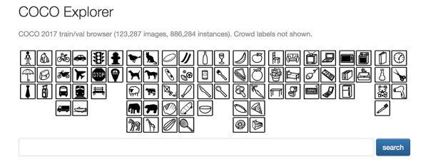
A quick glance at the COCO description paper17 informs us that the categories were chosen with the purpose of being recognised by a 4 year old. The selection for the vocabulary was made by combining categories from the already existing image dataset PASCAL VOC, with a subset of the 1200 most frequently used words that denote visually identifiable objects, and a list of categories that children aged 4 to 8 put together by naming every object they see in their indoor and outdoor environments. 272 categories resulted from this process, which were then ranked by the researchers based on their personal estimation of “how commonly they occur, their usefulness for practical applications, and their diversity relative to other categories”18.
The particularities of the categorisation are very easily observed in COCO: the only clothing item in the categories is a tie, yet there are two categories that refer to baseball: baseball glove and baseball bat. While there are categories for knives, spoons and forks, there is none for chopsticks. Hotdogs are considered as a single whole, while sausages and buns have no category.
What constitutes an object is an age old philosophical discussion, now resurfacing in machine learning practices. What constitutes a common object and under what taxonomy to place it is clearly a cultural question.
COCO’s categorisation system lays out certain relations between words that are amplified when the dataset becomes operationalised to make predictions. Multiple biases are at play in any dataset’s construction, including COCO’s. Starting from the keywords fed to the image and video hosting site Flickr, to the images that Flickr returns as being most closely associated to the keywords, to the biases of workers on Amazon Mechanical Turk who tag and segment all photographs. All of these steps lead to a particular worldview. The way in which the world is ordered as online images, becomes the way in which algorithms trained on COCO decode and re-encode the world.


The COCO dataset also contains pictures of representations of the object-categories.
COCO is considered a benchmark dataset. It is used by both academia and industry to compare their technological developments and to see which algorithm is the most ‘performant’. Algorithm programmers gain exposure and prestige the more their algorithms can accurately mimic the dataset’s labelling, as well as the speed with which they do this. Developers optimise their models to perform well on these public and relatively static datasets. This means that, even when these datasets are not the algorithm’s sole input, they nevertheless influence the output of decision making systems.
While the datasets and algorithms that are developed in-house by companies and governments often remain closed for examination from the outside, benchmark datasets provide a glimpse into the modus operandi of the industry. While the processes that lead to these public datasets remain largely invisible, examining them is an act of what communications theorists Star and Bowker call Infrastructural Inversion19. By looking at the visible ends of a complex, largely invisible, system, we can get an insight into how it functions.
Different from the ever evolving and accumulating in-house datasets of the large tech companies, benchmark datasets are static entities. As they are created with a specific idea, and from a specific cultural viewpoint, these static collections become capsules of space and time. For example, media artist Hannah Davis points out20 that in the Labeled Faces in the Wild (LFW) dataset from 200721 — a collection of more than 13.000 images, used for face verification — over 7% of the images are from just 4 people who are heavily involved in the war in Iraq22. Furthermore, if we map out the birthplaces of 3132 people in the dataset, out of the 5761 people in it, we can see the dataset leans heavily towards North America and Europe.
If sets such as Labeled Faces in the Wild provide the norm for machine learning models, that is, if machine learning models are optimised towards these datasets, it should come as no surprise that the outcomes of these systems are biased. When access to certain services is determined by whether one’s face is detected or not, the stakes become much higher. It is only since October 2019 that LFW provides a disclaimer on its website, mentioning some of its limitations in regards to representation: “we would like to emphasize that LFW was published to help the research community make advances in face verification, not to provide a thorough vetting of commercial algorithms before deployment.”23 This comment shows that even within the industry it is becoming ever more apparent that these datasets hold a crucial position.
Growing awareness of the bias within datasets largely follows pushbacks the industry experienced against face datasets in the summer of 2019: when the Financial Times began publishing articles discussing the use of images that were scraped from the internet. Many people’s faces were unwittingly included in huge private datasets. The newspaper based themselves largely on the Megapixels research project by artists Adam Harvey and Jules LaPlace, who traced the application of various publicly available face datasets to various places, including Chinese universities, affiliated with the Chinese military – and obviously universities such as the Massachusetts Institute of Technology are affiliated with the American Department of Defense. As such, these datasets might, directly or indirectly, be used to train algorithms which aid the monitoring of the Uighur Muslim minority in Xinjang24. All of a sudden our party photos may become weaponised without your knowledge or consent of it.25
The fact that this dataset is comfortably used by public and private research institutions to benchmark their algorithms falls in line with the history of sciences: the subject of inquiry is dehumanised in the name of objectivity. When philosopher and art historian George Didi-Huberman wrote about medical research into hysteria at the closing of the 19th century, he described how the technology of photography enabled the documentor to turn the individual case into a tableau – a (visual) statement. The tableau generalises the case, binding it to one camera frame, and one frame of reference.
A scenography of objects
One of the main goals of the COCO dataset is to aid visual scene recognition. In machine learning environments, scene understanding “involves numerous tasks including recognizing what objects are present, localizing the objects in 2D and 3D, determining the objects’ and scene’s attributes, characterizing relationships between objects and providing a semantic description of the scene.”26
In theater the word ‘scene’ refers to a unit of action, often delineated by time and space. In a scene, actors and objects are put on equal footing. Through carefully directed placement both function as carriers of meaning and intent in relation to the artistic goal of the production. An amalgamation of scenographic elements can orientate multiple acts of worlding through methods of sound, light, costume and scenery. Anthropologist Kathleen Stewart says in relation to scenography that “scenes becoming worlds are singularities of rhythm and attachment. They require and initiate the kind of attention that both thinks through matter and accords it a life of its own.” 27.
Through scenography, one can explore potentials to “irritate, highlight or reveal”28 the orders of the world. This provides the starting point of our interface to the COCO dataset. We juxtaposed the order of a 4 year old’s world, with computer vision applications of which we envisioned they could be deployed by any of the thirteen companies who collaboratively developed COCO. Together with illustrator Merijn van Moll, we designed three scenes. One depicts a view from a drone, another from a self-driving car, while the third one is the perspective of an algorithm that assesses product brands. All three of these technologies are currently being developed at either Microsoft29, Google30 or Facebook31.
The algorithmic point of view as being that of a four year old is blown up by presenting the scenes as a children’s picture book. On these backdrops, the user sets out to create their own scenography, using the categorised shapes from COCO’s taxonomy. This exploration of the scenes highlights the naivety of the set’s categories as they stand in stark contrast to their intended applications.
The choice of the annotator: Something-Something
When discussing the authorship of datasets for machine learning, the emphasis generally lies on academic and/or industrial researchers that initiate and manage the set’s development.
In his research on databases, Francis Hunger identifies authorship as being inclusive of administrators, data scientists, managers, programmers, engineers, user interface designers and politicians32. All of them influence the making of the database. In this sense, datasets too, have many authors, including the annotators, the cleaners, the data collectors, in addition to those listed by Hunger.
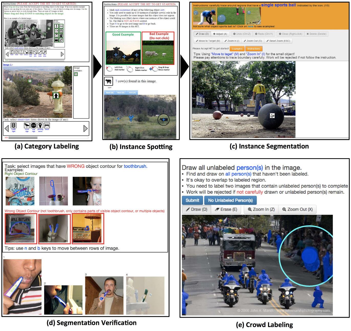
Early machine learning datasets were relatively small —sometimes consisting solely of photographs of some research group members— therefore, the task of annotation, or labelling, was something that would be done by the researchers themselves. As datasets grew larger, the task of annotation grew with it. Likewise, finding the people to do this labour became more complex. In 2006, Amazon was among the first to introduce a solution: their platform Mechanical Turk (AMT), on which ‘requesters’ can outsource their tasks to human ‘workers’. Each ‘Human Intelligence Task’ (HIT) is a small bundle of work, which is put up on the digital marketplace, and workers from all over the world can opt to do it. For instance, for the COCO dataset, which contains more than 300.000 images, over 70.000 hours of work has been done by workers on the AMT platform.
Amazon Mechanical Turk is named after the Mechanical Turk from 1770, invented by Wolfgang von Kempelen. It was a ‘chess automaton’, that depicted a man wearing Ottoman style clothing playing chess. Within this contraption, an actual human was hidden, who played the chess game and controlled the puppet. The subtitle of AMT is therefore fitting: Artificial Artificial Intelligence.
Aside from the United States, many of AMT’s workers come from India, Kenya, Vietnam, Venezuela or from what is often called the Global South. In these countries labour is much cheaper than in the Global North. While Amazon asks requesters to follow the wage norms of the places they work from, a survey around the platform shows that this is often not the case:
“A 2017 paper found that Turkers earn a median wage of approximately US $2 per hour, and only 4 percent earned more than $7.25 per hour”. –IEEE Spectrum
This imbalance perpetuates inequality instilled since the beginnings of colonisation. The Global North remains reliant on outsourced labour, it continues to develop a technocapitalist economy at the expense of other nations and peoples. A telling example is KolotiBablo, a company similar to AMT, which has a satellite project named Kolostories. On their website they collect testimonials of their workers, in which they describe the opportunities they gained through working for KolotiBablo. Note however, that the same company owns Anti-Captcha, a company that promotes themselves with the interchangeability of their worker: with the push of a button on their website you can ‘shoot down’ a worker.


While these platforms for ‘clickworkers’ pride themselves in providing opportunities for workers who demand flexibility or have no access to a healthy labour market, their median wage in 2017 was merely $2,- per hour. Furthermore, these platforms limit communication among their workers. In this light, Migration researchers Manuela Bojadžijev and Mira Wallis wonder if this work should be seen as a form of labour migration, namely ‘virtual migration’: migration without physical migration. They see new frictions appearing, “how we struggle across space and borders for better working conditions, or how we organise against different wages for the same type of work performed in different places”33.
Platforms such as Turkopticon and Turkerview try to fill this gap by providing web platforms and browser plugins that allow workers to aggregate and share information about requesters. The online community (eg. at the mturk subreddit) also provides a place for workers to discuss their assignments, and their methods to maximise their wage. The project Data Workers Union addresses this issue from a slightly different angle by regarding virtually all humans as data collectors for ‘Big Tech’, and demand unionisation. Similarly, the Pervasive Labour Union, addresses these issues by offering a publishing platform for discussions around data collection on commercial social media.
Not only the workers themselves try to optimise their workflow. Also the requesters try to design their interfaces in such a was as to balance the accuracy of the work (which should be high) vs. the worker’s pay (which they want to be as low as possible). Nicolas Malevé has conducted research into the optimisation of the interfaces through which these clickworkers work. More on this can be found in our interview with him.
Affordances of objects, not people
The conditions of AMT workers became all the more relevant when we started looking into the Something-Something dataset curated by the company 20 Billion Neurons. The authors of this dataset take an interesting philosophical approach to object recognition, and define objects not by their ‘class’ but by their affordances: “Closely related to material properties is the notion of affordance: An object can, by virtue of its properties, be used to perform certain actions, and often this usability is more important than its “true” inherent object class (which may itself be considered a questionable concept)” 34.
In an attempt to detect the affordances of objects, they created a video dataset based on a set of action templates for interaction between objects. For example “holding [something] behind [something]” or “pushing [something] with [something]”. They asked workers on Amazon Mechanical Turk to record videos in first-person view, while enacting the specified movements with objects of the worker’s own choice. In total they collected 220.847 videos of 2-6 seconds.
However, when looking at their Turkerview page one can question the agency that their workers have over their work. For the task of reviewing 50 of these videos —to see if they fit the category that was labelled by their submitter— one gets 10 cents. One of the reviewers puts it clearly:
“Slave wage garbage that shouldn’t be tolerated by anyone. The requester is fully aware that they’re paying garbage, as they have not updated the pay in months and have left their HITs without any quals [worker qualifications], letting slave wage workers complete them.
50 videos to rate for 10 cents, and there’s a 3-4 second timer on each one, so there’s no way to complete this in a manner that would even raise the hourly out of the slave wages”.35
When considering an explorative interface for this dataset, the conflict in agency provided our starting point. The worker has the freedom to pick any object they’d like to create the videos with, but they are still forced, by economic circumstances, to accept a fee for this work that would be considered marginal in the economy where the company operates.
The first-person perspective of (most of) the videos made by the Amazon Turk Workers made us quickly think of the ‘game’ as a device to interweave a narrative contextualisation of the excruciatingly slow way of making a living wage. All the videos bear inherently iconic game aesthetics. The player sets out to explore the dataset on an interface designed after by choose your own adventure games and dungeon explorer style games.
Our interface to the Something-Something addresses the conditions under which click workers have to work in order to produce the dataset. At the same time, the individual videos within this collection are brief encounters with the workers. Sometimes they show a lot of care for their recording, while others are as fast as possible. They provide a glimpse of the human in the dataset. They are the ‘Ghost Workers’, or ‘Guest Workers’, the hidden labour behind machine learning models.
Repository
Activity
- 11 March 2020: Publication release at Framer Framed: Plotting Data, Acts of Collection and Omission.
- With sessions by invited artists Julie Boschat Thorez & Sami Hammana and Nicolas Malevé.
- 2 November 2019: Panel Calm Technology as part of Impakt 2019
- 19 June 2019: A dive into the Enron corpus, workshop as part of Re-Imagining AI conference (Critical Media Lab Basel)
- 12 June 2019: Function Creep in the Wild, workshop as part of Eindhoven Footnotes (Onomatopee)
- 21 February 2019: Plotting the Enron Corpus, workshop as part of Broadcasting from Babylon (DAS Graduate School and NetDem)
- 4 November 2018: The Data Flaneur, part of Hello World!
- 19 September 2018: Presentation on Data Dramatisation at Digital Cultures Conference, Leuphana University
- 3-4 April 2018: Workshop Urban Interfaces, Utrecht University
Colophon
Text & Interfaces: Cristina Cochior & Ruben van de Ven
Editing of introduction: Amy Pickles
Background illustrations for the COCO interface: Merijn van Moll
Enron Script: Amy Pickles
Thanks to:
Creative Coding Utrecht, Annet Dekker, Marloes de Valk, all the participants to the Plotting Data workshops
This project is supported by the Creative Industries Fund NL. 
Notes
The Point of Collection, Mimi Onuoha (2016).↩︎
Evil Media, Matthew Fuller & Andrew Goffey (2012).↩︎
Humanities Approaches to Graphical Display, Johanna Drucker (2011).↩︎
Data Infrastructure Literacy, Gray J, Gerlitz C, Bounegru L. Big Data & Society. July 2018.↩︎
The term data dramatisation was first conceptualised by Memo Akten in an article on Medium. However, it originated from the architect and artist Liam Young.↩︎
See ‘The Disenchantment of Affect’ by Sengers et al. (2007) for a call to a more open form of affective appeal.↩︎
CALO was a DARPA sponsored project by SRI International, an American nonprofit scientific research institute and organization based in Menlo Park, California. The name is inspired from the Latin word “calonis” and means “soldier’s servant”. One of the spring-offs from CALO was Apple’s digital assistant Siri.↩︎
Releasing such a large amount of private conversations into the public domain raises significant issues of consent. Although there is a possibility to request the deletion of certain emails, or at least strip it from social security and credit card numbers, this creates further complications when the maintainer must rely on the goodwill of those who already downloaded the dataset to replace it with a new version. This in turn paradoxically generates even more attention and visibility around the employee who wishes to delete their record#. Within the interface, we have tried to obscure the recipient and sender from the email head.↩︎
Enron: The Smartest Guys in the Room (2005) documentary.↩︎
The Enron Corpus.↩︎
Further discussion on benchmark datasets is in the COCO dataset text of this publication.↩︎
Amy Pickles also uses references for action, using pedagogical methods in workshops. For these scripts, references included composer Pauline Oliveros’ Sonic Meditations, Raymond Murray Schafer’s sound education exercises, playwright debbie tucker green and the writing of Georges Perec and Brandon LaBelle.↩︎
Quote from an email from Amy Pickles addressed to us and the workshop participants who we would be performing with.↩︎
Microsoft COCO: Common Objects in Context, Tsung-Yi Lin and Michael Maire and Serge Belongie and Lubomir Bourdev and Ross Girshick and James Hays and Pietro Perona and Deva Ramanan and C. Lawrence Zitnick and Piotr Dollár (2014, p 1).↩︎
Microsoft COCO: Common Objects in Context, Tsung-Yi Lin and Michael Maire and Serge Belongie and Lubomir Bourdev and Ross Girshick and James Hays and Pietro Perona and Deva Ramanan and C. Lawrence Zitnick and Piotr Dollár (2014, p 4).↩︎
Sorting Things Out, Geoffrey Bowker and Susan Leigh Star (2000).↩︎
A Dataset is a Worldview, Hannah Davis (2020).↩︎
The Labeled Faces in the Wild dataset.↩︎
530 images from George W. Bush, 236 of Colin Powell, 144 of Tony Blair and 121 of Donald Rumsfeld. These 1031 images make up 7,78% of the 13.244 images. And then we’re not yet counting eg. the 109 images of Gerhard Schröder.↩︎
Following the Internet Archive’s Wayback Machine this disclaimer has been added between September 3 and October 6 2019.↩︎
For this, see the research by Adam Harvey and Jules LaPlace on the Brainwash dataset.↩︎
It is hard to know whether your face is in one of these facial recognition datasets. For example, American multinational technology company, the International Business Machines Corporation (IBM) has its own dataset for facial recognition, consisting of many images from the public domain, called Diversity in Faces. However, in order to find out if you are in the set, one needs to email the exact URLs of the photos one wants to inquire upon. Without knowing who or what is part of this dataset, it becomes virtually impossible to request removal from such a collection. The politics of inclusion become even more violent when we consider an example provided by researcher Os Keyes. In The Gardener’s Vision of Data, they describe how the National Institute for Standards and Technology (NIST) curates a series of datasets with which they benchmark commercial systems for facial recognition. However, the contents of these datasets consist of “immigrant visa photos, photos of abused children, and myriad other troubling datasets, without the consent of those within them”. Keyes highlights a specific subset which is available for public download, the ‘Multiple Encounter Dataset’. The MEDS is a collection of mugshots of 380 people, collected and circulated without their consent. An examination of their photos shows many of these people in distress; sometimes they are even wounded.↩︎
Microsoft COCO: Common Objects in Context, Tsung-Yi Lin and Michael Maire and Serge Belongie and Lubomir Bourdev and Ross Girshick and James Hays and Pietro Perona and Deva Ramanan and C. Lawrence Zitnick and Piotr Dollár (2014, p 1).↩︎
Kathleen Stewart, Tactile Composition (2014, p 119) in Rachel Hann, Beyond Scenography (2019, p 2).↩︎
Rachel Hann, Beyond Scenography (2019, p 2).↩︎
Microsoft to Develop Software to Teach Drones, Robots, and Drills How to Think, Tech Times (2019).↩︎
Creepy Facebook Patent Uses Image Recognition to Scan Your Personal Photos for Brands, Fastcompany (2019).↩︎
Epistemic Harvest – The Electronic Database as Discourse and Means of Data Production, Francis Hunger (2018).↩︎
Researching Labour Mobility in Digital Times, Moritz Altenried, Manuela Bojadžijev, and Mira Wallis (2018).↩︎
Raghav Goyal et al. (2017, p 2) The “something something” video database for learning and evaluating visual common sense arXiv:1706.04261↩︎